
10. Minnesota Wild
If you’re the type of person who enjoys the Christmas season, then chances are you love this jersey. I mean red and green together - you really couldn’t think of anything better then that? Maybe I should let them slide since it is Minnesota and they aren’t exactly on the cusp of the fashion industry out there in eastcabum...(fill in the rest). When I think Wild, I think something badass, and the Wild logo and jersey is far from that. You would have to be pretty Wild to rock one of these though, maybe that’s what they were going for.

Christmas all year long in Minnesota...
9. Baltimore Ravens
Expansion teams, for one reason or another, usually have horrible jerseys and the Ravens are no exception. What grown man wouldn’t want to look like Barney when rooting on their favorite team every Sunday? Nothing makes you feel like a man more than...wearing purple. Each year, the Steelers game I look forward to going to the most is the Ravens game. Why? So I can unmercifully heckle and harass all those morons from B-more who wear those purple jerseys, to the point where they need a police escort to get inside Heinz Field. It’s just too easy.

Ray Ray, do you have a purse to go with that uniform?
8. New Orleans Hornets
Whenever they were located in Charlotte, the Hornets' jerseys were bad. I guess they thought changing to teal and yellow was an improvement...I’m thinking not so much...
Yes, they did take out the purple, but they decided to go with the equally girlish colors teal and yellow - or is that canary? Not a very smart move. If I were Chris Paul, I would hang my head in shame every time I ripped off my warm-ups and ran onto the court.

Pastels? Really?
7. Virginia Tech Football
The Hokies have had a rough year so far, first the tragic shootings, then the whole Michael Vick story. So I do feel bad for the V-Tech students, but it won’t stop me from hating on their football uniforms. They are kinda plain, which I'm into because I like the old school uni’s, but the colors just don’t go together at all. Maroon and orange - what did you do throw two darts at the color wheel? Crayola wouldn’t dare to put these two crayons next to each other in the crayon box.

Hey Vick, I'd be a criminal too if I had to wear this crappy jersey...
6. Oregon Football
They just barely edge out their college counterparts at V-Tech, but for good reason-these jerseys (and I do wanna make sure I make that plural) are just God-awful. I’m not even going to get into the color combo, which is one of the worst I’ve seen. It's the brightness of these jerseys that makes them even worse. It's like they’re reaching out of the picture and slapping you in the face with their ugliness. And the addition of those fake steel marks (or whatever the hell they are) only make them that much worse. Thank God the Steelers never tried to make this happen. They actually kind of look like tire treads, and that reminds me...the person who gave the final okay on these jerseys should be run over by a truck!

Quack! Quack! Quack!
5. Nashville Predators
This is by far the most hideous jersey in the entire NHL, if not in all of hockey...ever. This jersey is pretty weak, but it's most certainly the shiny silver that puts it over the top. It looks like some sort of space suit with that shiny Mylar-like material on the shoulders. This jersey without a doubt looks like it should come from the 1980’s, and I don’t consider that a positive.

M.C. Hammer just called and said he wants his jersey back...
4. Pittsburgh Pirates Red Alternates
Don’t get me wrong, the regular Bucco jerseys aren’t really anything to write home about, but at least they go along with the whole black and gold theme of our fair city. I don’t know what the hell they are thinking trying to rock out the red cut off sleeve jersey; it just doesn’t work for them at all. Any one who has been to a home Buccos game on a Sunday knows what I am talking about. With any luck these eye sores will be gone within the next year or two. I mean, the Pirates should at least be able to look good while losing 100 games a year.
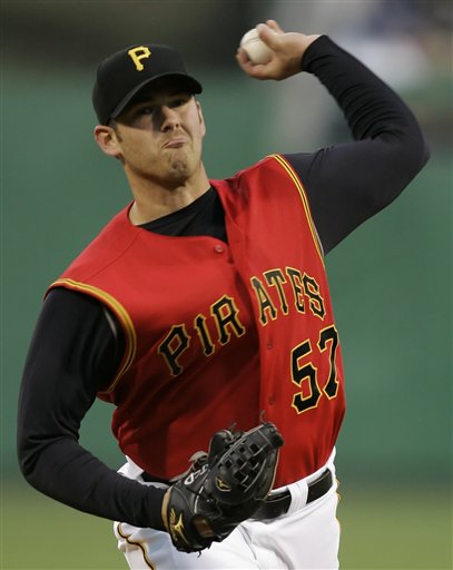
Somebody do me a favor and call P Diddy and tell him to design our new alternate jerseys...
3. Cleveland Browns
Now this one is kinda screwed up because Cleveland actually had the chance to change those atrocious uniforms when they re-entered the league in 1999. However, they decided that sticking with the poop brown jerseys was a good course of action. (What the h were they thinking?)
I’ve said it before and I’ll say it again - there is no other professional sports team with brown in their logo. You would think this would give those jagoffs in Cleveland a clue, but I suppose they are dumber then they look. Why anyone would buy a brown jersey is beyond me, but I’m thinking orange isn’t much better. They don’t even have a freakin' logo! Maybe their new mascot can be a giant version of Mr. Hanky from South Park, seems like it would be a good fit. Hiiiiiiidieeeeeeee Hoooooooooo!

It's poop again...
2. McDonalds All-American
These are a less popular pick since the game is only held once a year, but I thought they were good enough to make the list because they actually piss me off - they're that super-ugly. Don’t try to sit here and tell me that Mickey D’s doesn’t have enough money to make them better, because that is blasphemy. McDonald's has served over a billion people worldwide, so that bank account is pretty hefty. They manage to get the greatest players in high school B-ball to come play for them, but their uni’s are worse then my 12th grade St. Rosalia CYO jerseys, and we had to buy our own shorts!

Do you think they made them ketchup and mustard colored on purpose?
1. Miami Dolphins
Okay folks, I am going to have to thank our reader MZP for pointing this one out to me. She reminded me one reason I might hate these jerseys so much is because of the first car I ever had - a 1990 Teal Ford Tempo. I'm actually kind of embarrassed to admit that I rocked a teal car that couldn’t go up the steep hills of Pittsburgh if you had the AC on. It had no prayer of making it if Snack was riding shottie. The Dolphins should be even more embarrassed that they have the audacity to wear a teal colored jersey each and every Sunday. Teal is a girl’s color and football is a man's sport, so this equation just doesn’t equal out.

Even JP looks like a wuss...
Honorable mention: Atlanta Thrashers, Hawaii Football, Seattle Mariners, Phoenix Suns, Tampa Bay D-Rays.
Bonus 50 ugliest things in sports link…
Well boys and girls, there's our list. Remember, it's just our opinion, feel free to add any you think we ommitted to the comments section. And don't forget to check Pierogi's N'at for Snack and Diego's daily take on everything sports.
Until next week...
8 comments:
Have you seen the Washington Wizard's, Black and Shimmering Gold two tone jersey? Worst uni I've ever seen.
No surprise, Ravens and Browns are on your list. Hey you forgot the Bengals, you might as well finish out the afc north while your at it. Typical biased steeler fan. The ravens all black jerseys are bad ass. The all black combination they wear is the most intimadating uniform in the league, and I hate the ravens, so thats not easy for me to say. The vikings wear more purple than the ravens, but you excluded them. I guess because they aren't rivals of your beloved steelers. The Browns jerseys are historic, always have been the same. Much like the steelers, they have colors unlike anyone else, thats what you want in your uniform colors. But again, its cleveland, so of course you're gonna find a reason to hate on them. Those mustard colored steeler helmets looked terrific with those throwbacks this year by the way, yeah, not much room to talk there raul. And that unique logo on one side of the helmet that steeler fans are so proud of is too played out. The Browns are the only team not to have a logo on there helmet, but they don't need to let everybody know about it.
One thing I do agree with are the Pirates uni's. Those need to go. They deserve all the abuse they got for those. From mcdonalds workers to dhl workers. They are awful. The all black jersey with the gold numbers need to come back as alternates. Scrap the red, black and gold is all you need.
Finally, you really struck a nerve when you messed with the dolphins. Yeah teal isn't the most masculant color, and yeah, the all teal jersey isn't one of my faves either. But they only wore those twice all year. (same as many times as the steelers wore them bumble bee costumes) The dolphins wore all whites in 14 of their games this year and 15 of their games last year. They usually have one uniform, white pants, white jersey, white helmet. They wear white at home and on the road. And its a great, simple, uniform.
You love and miss Joey Porter, you know it.
I drove a Ford Tempo to, but it was grey.
Syracuse's new football uniforms are pretty bad. I hate it when a team or school gets rid of the uniforms from their winning era and replaces them with ugly new uniforms, (Pitt's script logo would fall into this category).
I loved those old Pitt uniforms...In fact, I'm surprised the Stache hasn't brought them back, seeing as they were what he wore back in the day.
On top of that, everyone I know agrees with me - no one likes these new jerseys as much as the old ones.
Bring em back Wanny...
The worst logo is Pitt's otter looking thing they adopted this year.
I got a hat for Christmas that has that sabre toothed otter-type creature on the back.
You could dress for every Oregon football game from your freshman to senior year and wear a different uni for each game
you have been cowed by the cartoon conglomerate of bristol ct...chris berman has perpetrated a great lie in his quest to get slobbering automatons to agree that the chargers sissy-blue throwbacks are somehow acceptable...they are so hideous i wish he be wearing one in the mens room of an i95 rest stop when a raiders fan facing a third felony conviction spots him after binging on meth and being kicked out of the espnzone....maybe then the world and the drooling masses will see what a crime against hufanity these uniforms are
Post a Comment